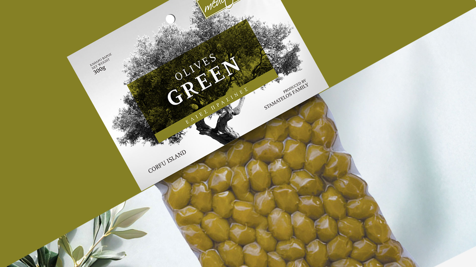
Nyssos / Olives


When Design Honours Tradition
The Corfiot olive tree, a symbol of heritage and authenticity — becomes the heart of a packaging series that captures the true character and essence of Nyssos olives.
Our aim was to give each variety its own distinct identity, one that speaks directly to the visitor: quality, origin, story.
The black-and-white illustration of the olive tree serves as a tribute to the Corfiot landscape, a land that produces olives with a bold personality and a rich, full flavour. Against this timeless backdrop, every variety is marked by its own colour, a clear visual “signal” that helps consumers instantly recognise the product within the rhythm of the tourist market.
A clean label structure, a measured balance between tradition and contemporary design, and a respect for the unique traits of each variety come together to create a range that stands out both in taste and in appearance.
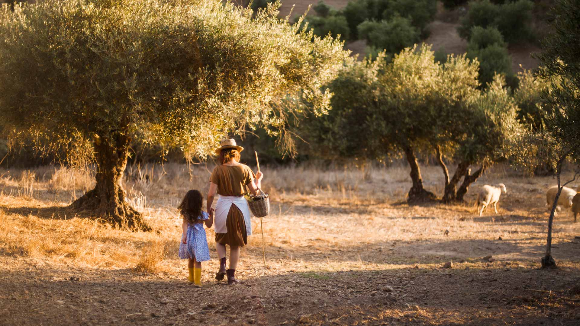
Nyssos olives invite visitors to experience genuine Greek flavour, through a packaging design that proves one simple truth: when simplicity is crafted with care, it becomes truly iconic.