Nyssos / Bio Olive Oil


A Symbol in Every Drop
The premium organic olive oil market is intensely competitive. Nyssos needed packaging that would instantly convey its core values: organic cultivation, superior quality and a deep connection to the Greek land. The design had to be both timeless and contemporary — appealing to a discerning international audience.
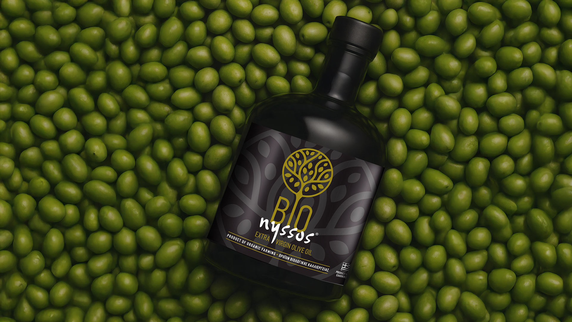
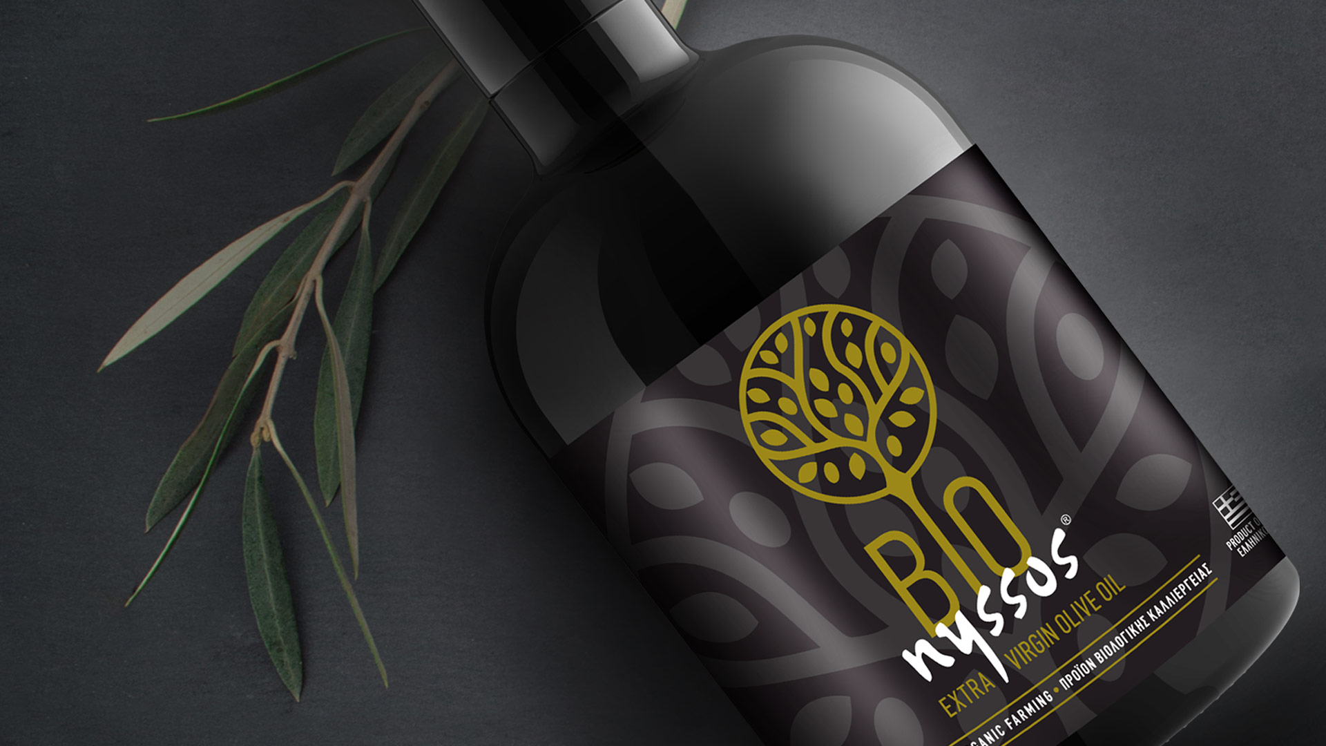
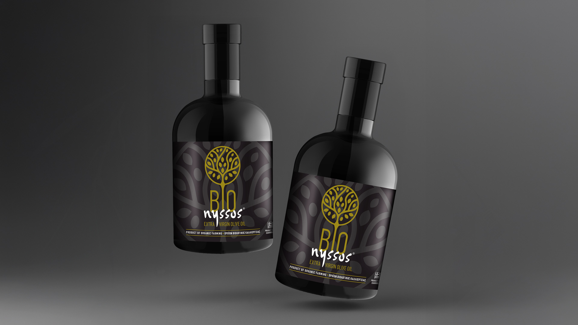
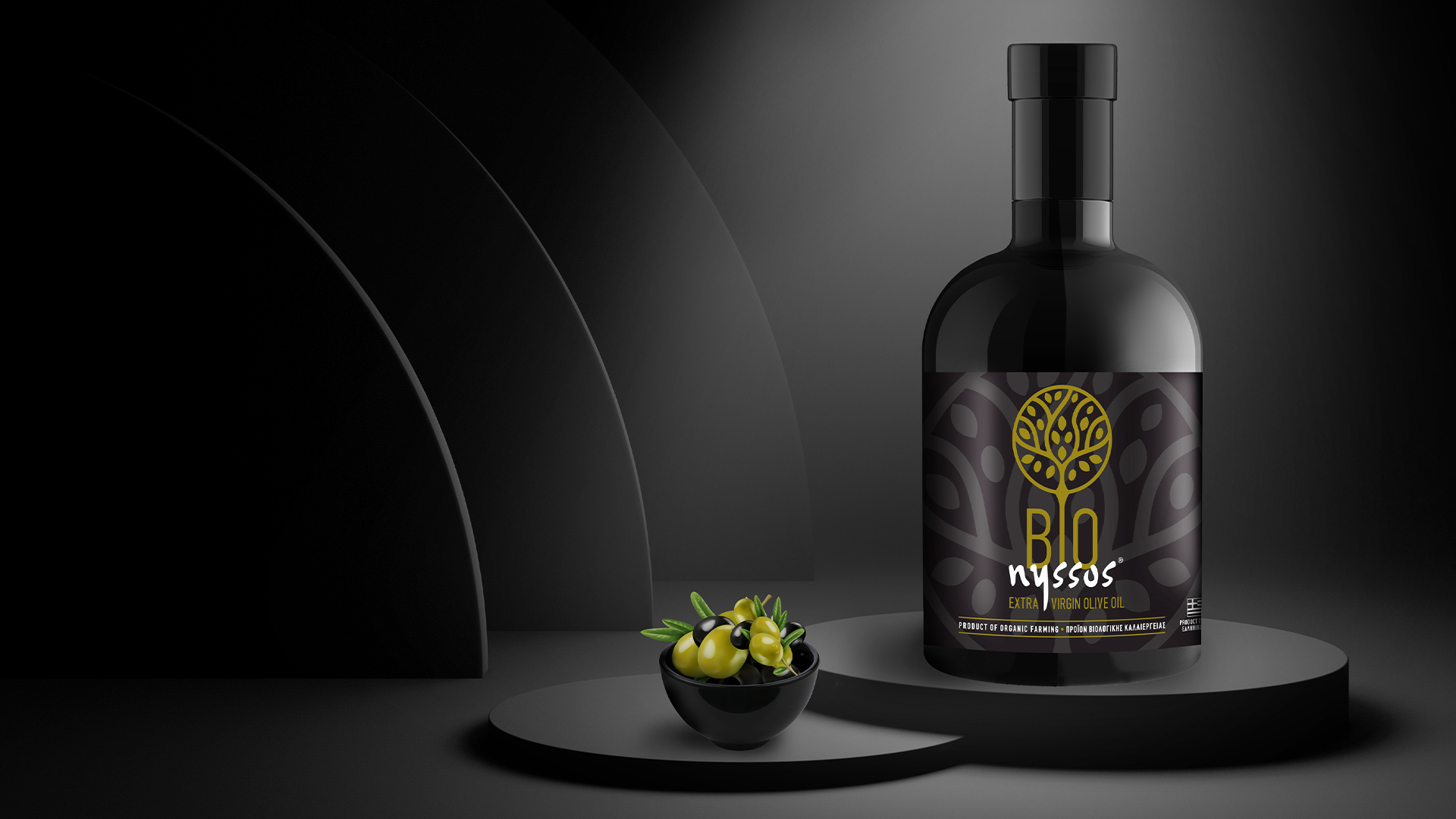
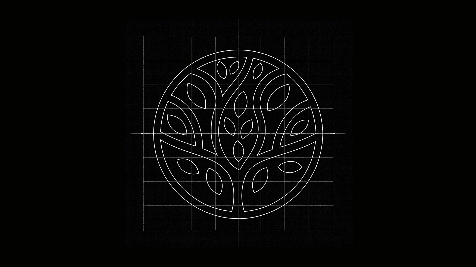
Our central concept was to create a strong, iconic symbol that would become the heart of the brand’s identity. The strategic insight emerged from the word “BIO” itself. We chose to transform the letter “O” into a circular, emblematic olive — an ancient symbol of life, purity and heritage. This single mark would tell the entire story of the product.
Our solution is a narrative of quality rooted in nature, expressed with contemporary elegance.
The custom logotype, featuring a golden olive tree rendered in clean, geometric lines, becomes the focal point of the label. It symbolises both the rich heritage and the modern outlook of Nyssos.
The label pairs this golden emblem with a sophisticated matte-black background. A subtle embossed pattern of olive shapes enriches the visual and tactile experience, adding a sense of understated luxury.
The overall aesthetic is clean, balanced and confident. The black bottle not only protects the precious contents but also elevates the premium character of the brand, creating a product that stands out through its refined simplicity.