Superfoods / Anasa Cough Syrup

A Breath of Natural Relief
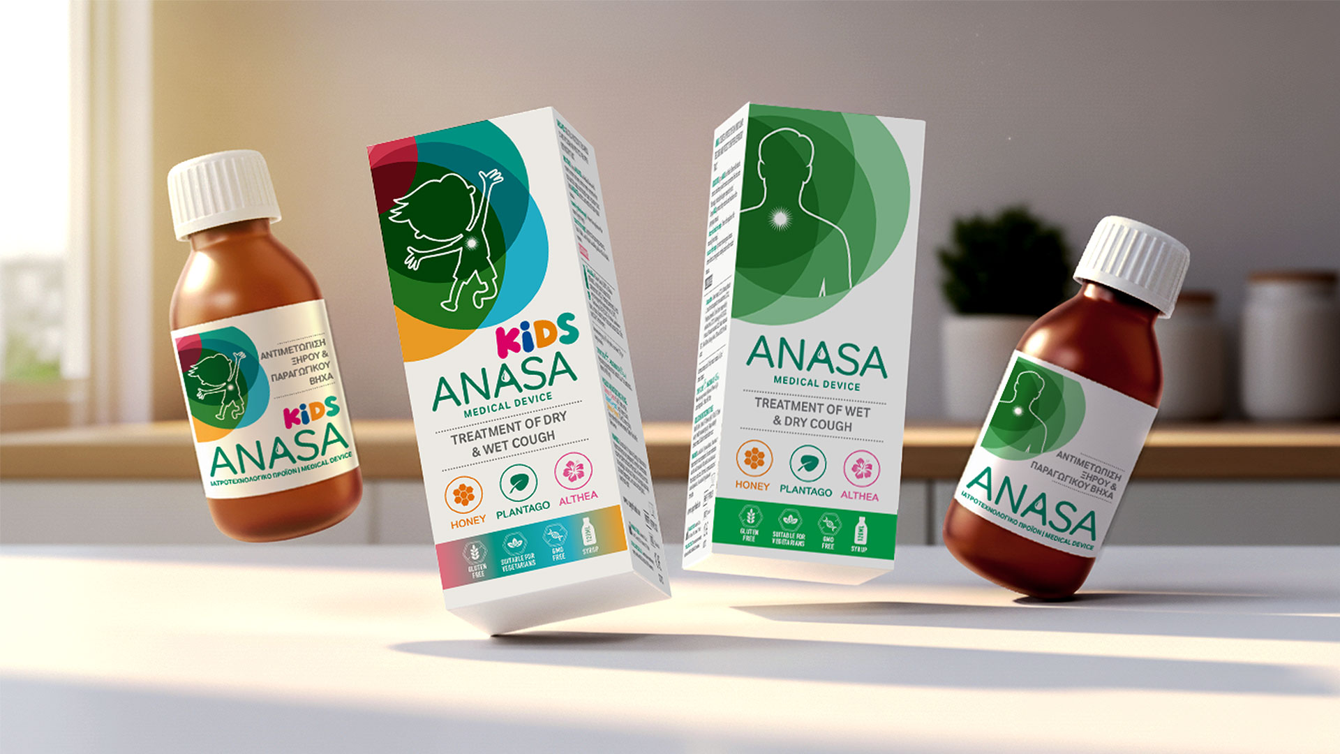
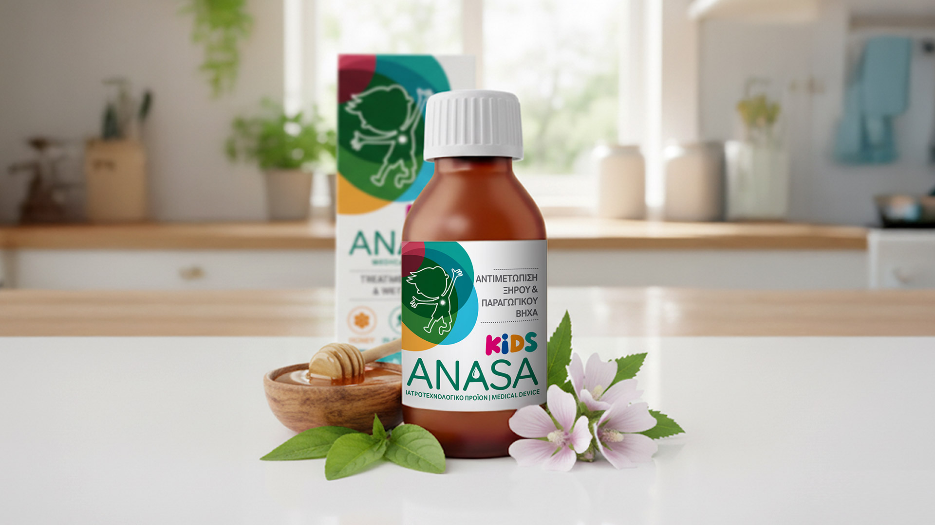
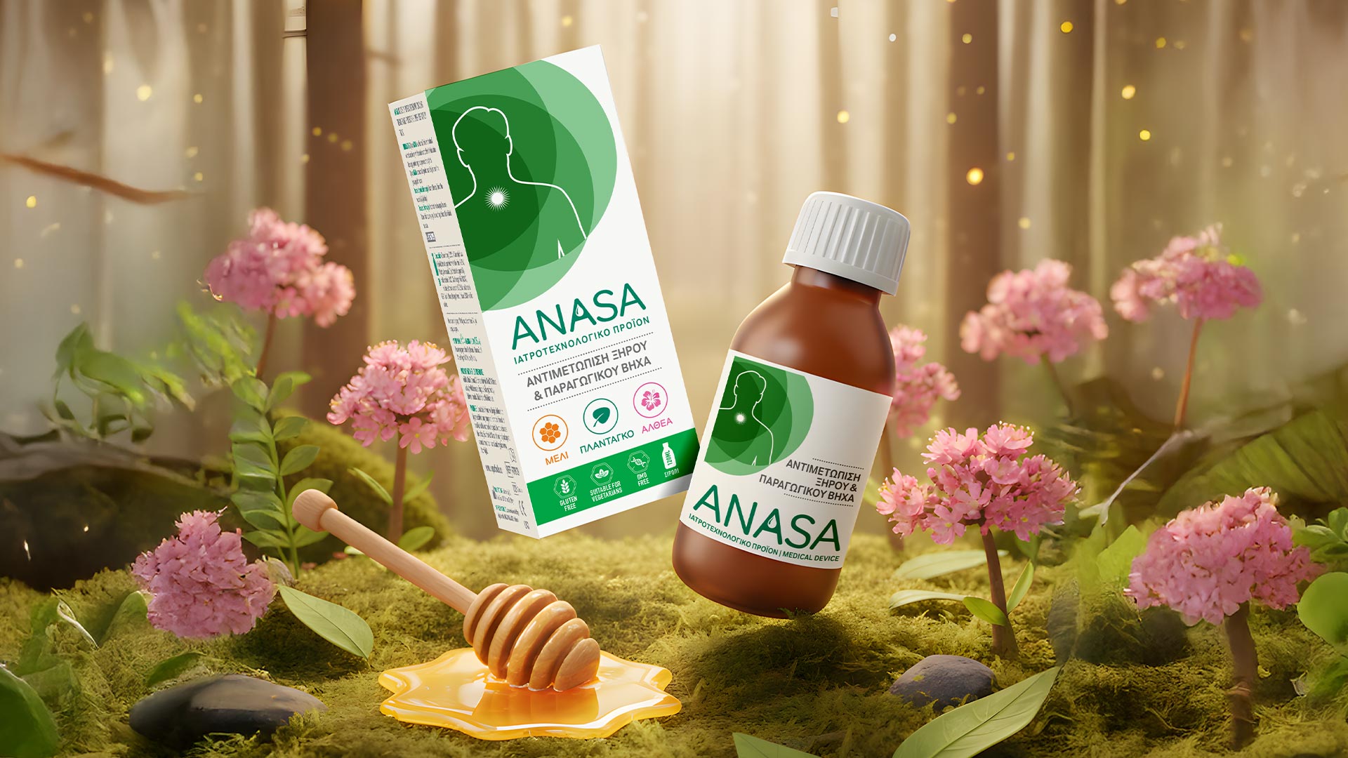
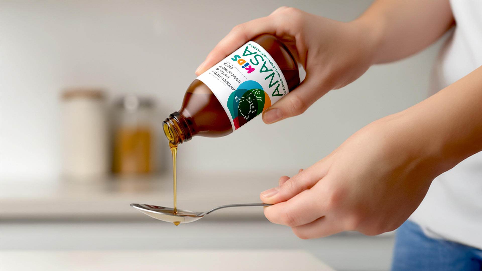
When redesigning the ANASA & ANASA KIDS packaging, every design element had to express relief and care. Combining honey, plantago, and althea, the products required a visual language that reflects their natural effectiveness and reliability.
Our goal was to balance medical credibility with a sense of natural softness. Using a calm, light color palette and subtle illustrations inspired by nature, we created a visual identity that immediately communicates comfort and healing.
We used clean typography and natural hues to distinguish ANASA from ANASA KIDS while maintaining brand coherence. The minimalist design and organic motifs build trust and convey purity and calmness.
The new packaging refreshed the brand image, highlighting natural care and modern aesthetics. Through thoughtful packaging design, ABC Design Communication transformed ANASA into a symbol of natural wellness and gentle healing.