Minos 21
The Spray That Radiates Expertise and Strength
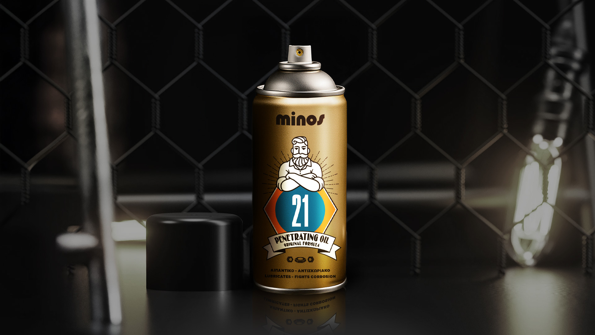
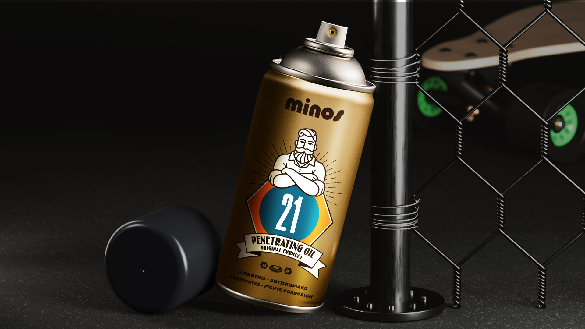
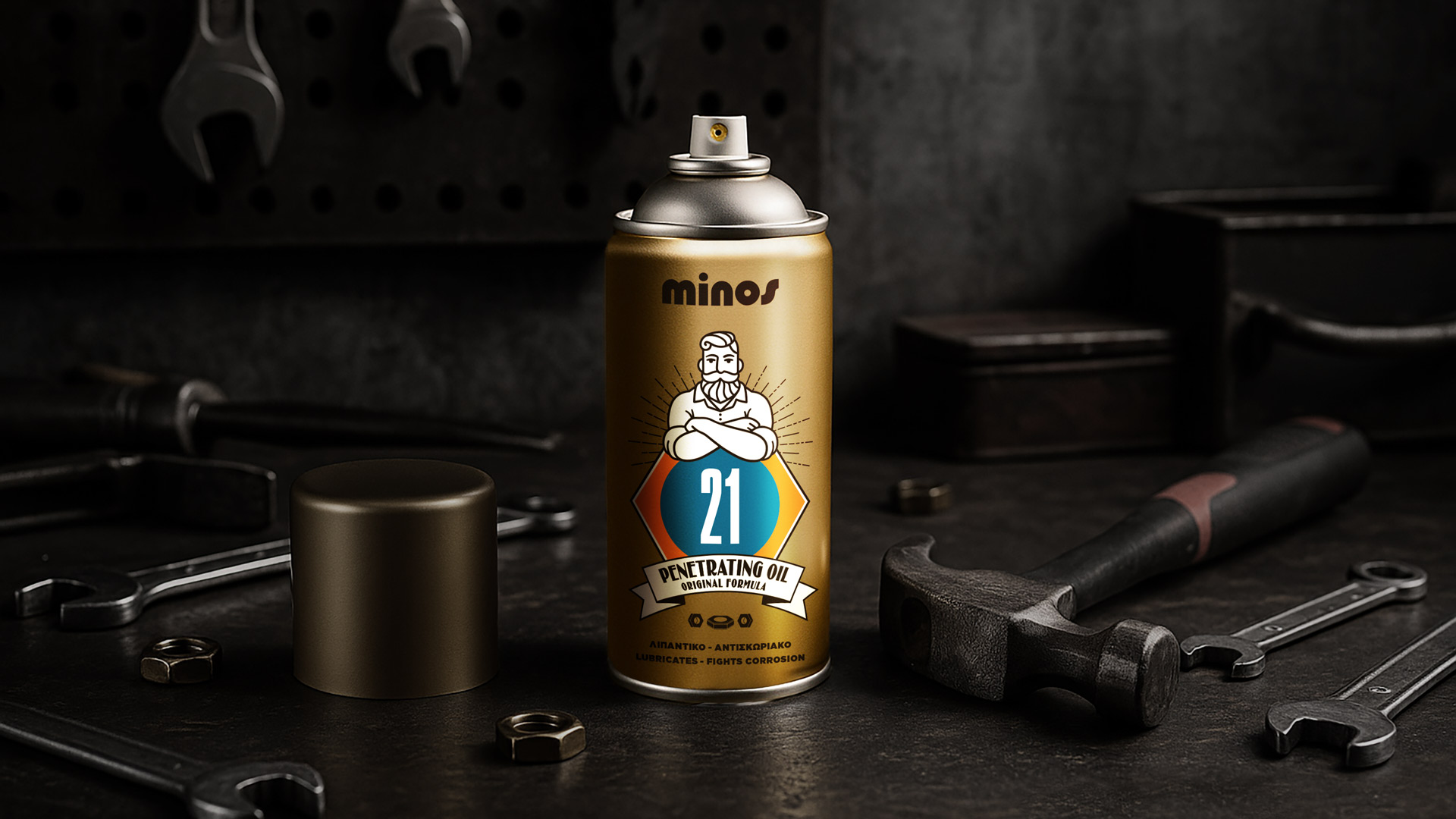
Minos 21 entrusted us with designing a packaging for a spray that embodies power, endurance, and daily vitality. The challenge was to create a design that balances premium aesthetics with masculine energy - a product that stands out on the shelf and radiates confidence at first glance.
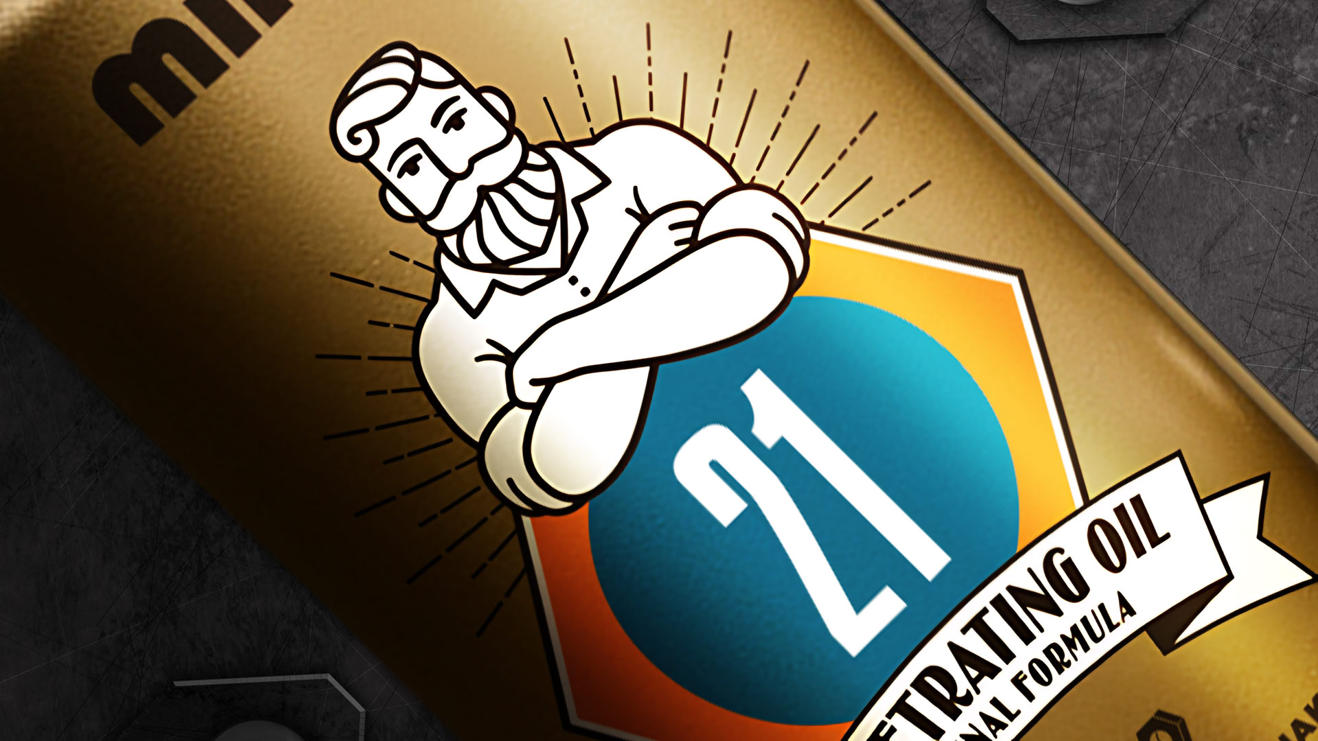
Our strategy focused on expressing energy through simplicity and shine. Gold was chosen not just as a symbol of luxury, but as a visual metaphor for strength and resilience. The front figure became an emblem of endurance, a bold icon representing confidence and power.
ABC Design Communication transformed Minos 21 into a true design statement. The metallic gold surface reflects light and energy, while the centered figure acts as a seal of strength. The sharp contrast with the white typography enhances clarity and precision, giving the product a sense of both elegance and power.
The final outcome is a packaging that radiates energy, determination, and prestige. A bold visual identity that not only captures attention but amplifies the brand’s core values, proving that design can become a mirror of the product’s very essence.