Frezyderm / Toothpaste

Revolutionary Visual Identity
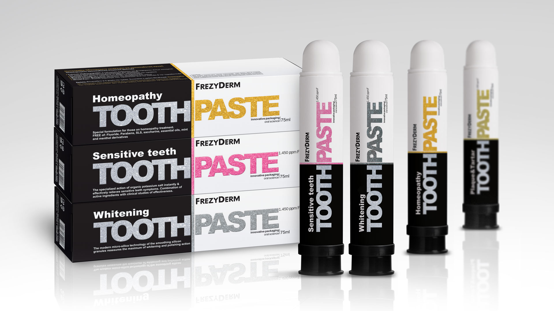
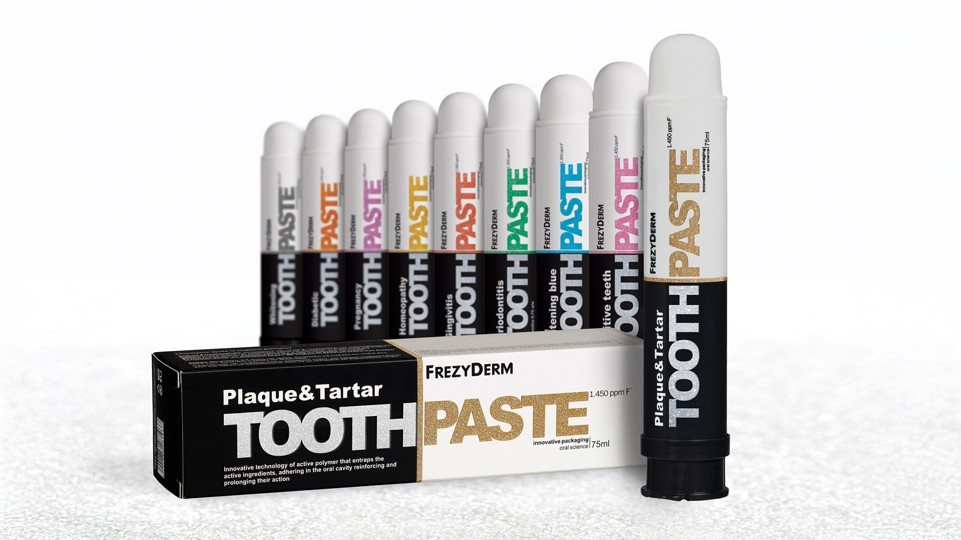
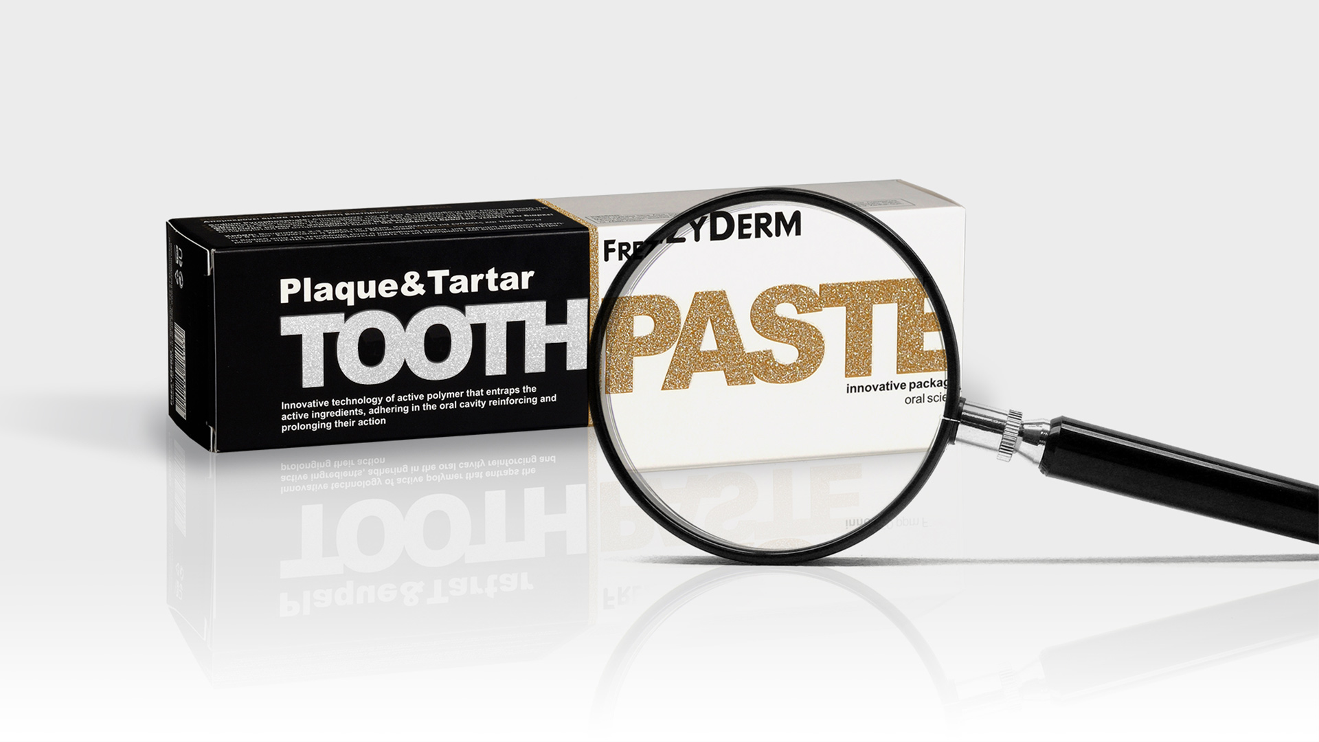
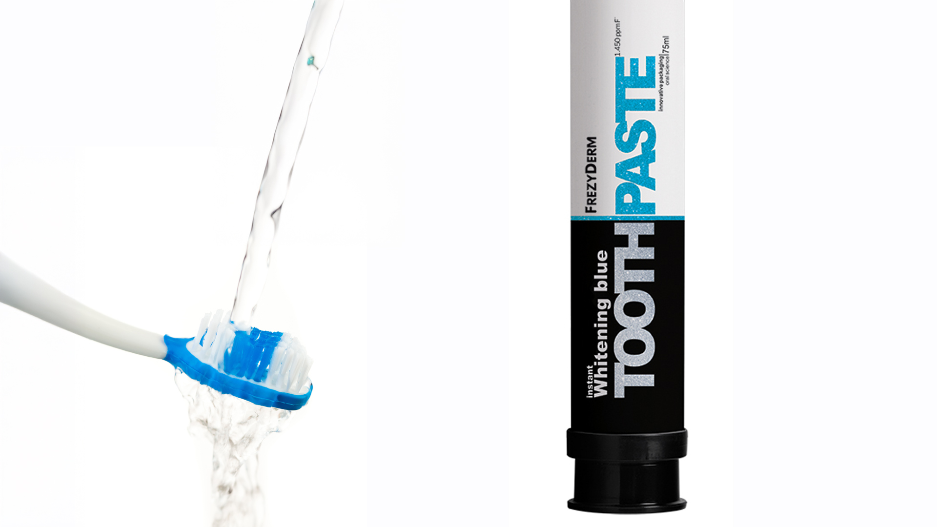
We set out to visually express Frezyderm’s breakthrough in oral hygiene through a series of nine innovative products for adults, sold in pharmacies and recommended directly by healthcare professionals. Our goal was to create a complete visual identity defined by uniqueness, forward-thinking design and strong shelf visibility.
Our creative approach focused on giving the line an instantly recognisable character that would differentiate it from the competition both aesthetically and technologically. We incorporated glitter using an advanced printing technique, adding a modern, unexpected spark that makes the series stand out at first glance. Each product was also given its own vivid and distinct colour code, allowing consumers to identify the formula and purpose quickly and intuitively.
The result is a line that embodies expertise, superior quality and Frezyderm’s progressive philosophy. The innovative visual identity not only distinguished the series on the shelf but was also validated by the enthusiastic response of consumers, who embraced one of the most groundbreaking toothpastes on the market.